

Your screen is lying to you. Here is how to make it tell the truth.
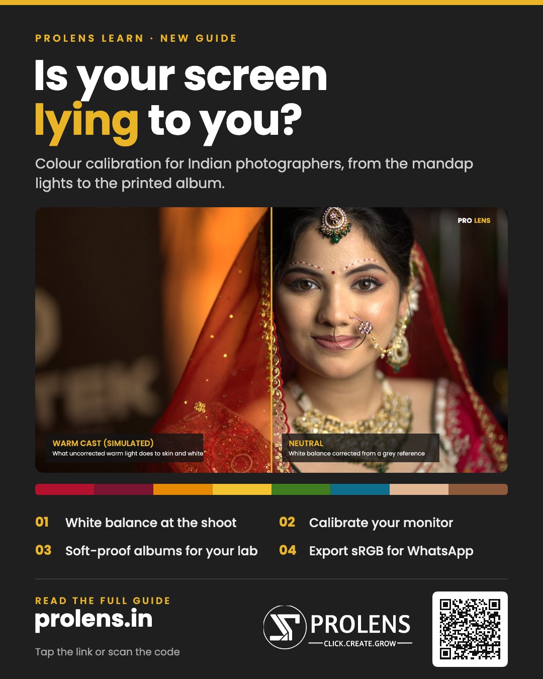
You edit a bride’s lehenga until the red is perfect. The client opens the gallery on her phone and asks why it looks orange. The album comes back from the lab and the skin tones look muddy. Nothing was wrong with your camera or your editing. The problem was the screen you edited on.
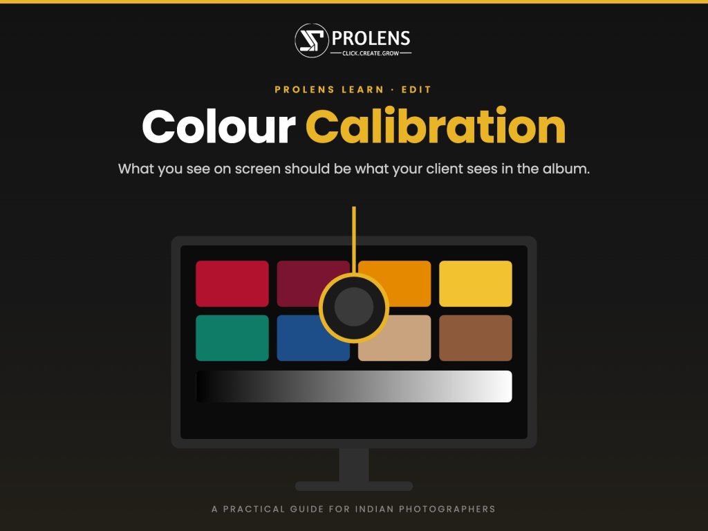
Colour calibration fixes this. It sets your monitor to a known standard, so the colours you see while editing are the colours everyone else sees on accurate screens and in print. Here is a practical PROLENS guide for Indian photographers and filmmakers.
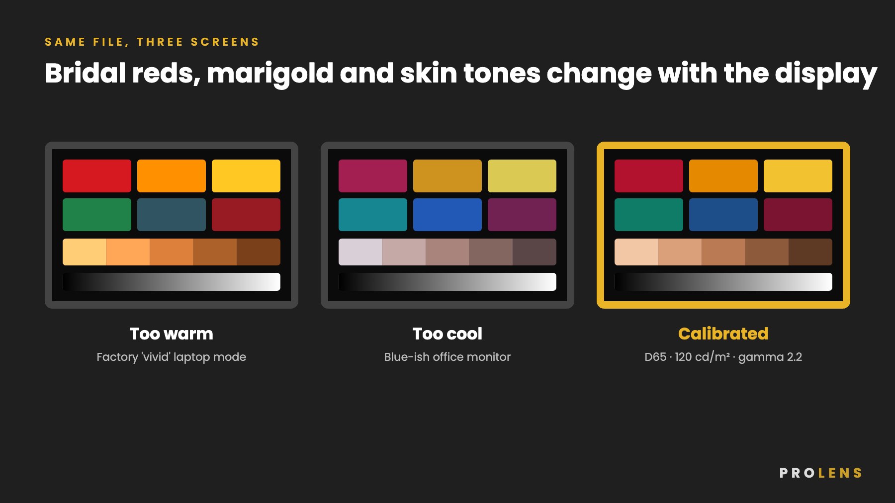
1. What Colour Calibration Actually Means
Every screen shows colour slightly differently. Laptops often ship in a bright “vivid” mode that makes reds and yellows pop. Office monitors often run cool and blue. Phones vary from model to model.
Calibration uses a small device called a colorimeter, which sits on your screen and measures the colours it displays. Software then builds a profile that corrects your screen to standard targets for white point, brightness and gamma. Once calibrated, a neutral grey looks neutral, skin looks like skin and a Banarasi red looks like the actual saree.
Your eyes cannot do this job. They adjust to whatever screen you are looking at within minutes, which is exactly why a screen can drift warm or cool without you noticing.
2. Why It Matters More in India
Indian weddings and events are some of the most colour-demanding work a photographer can do:
- Reds, maroons and magentas in bridal wear are the first colours to go wrong on an uncalibrated screen. They shift orange, pink or simply oversaturate.
- Turmeric, marigold and gold zari lose their detail when a screen is too bright or too warm.
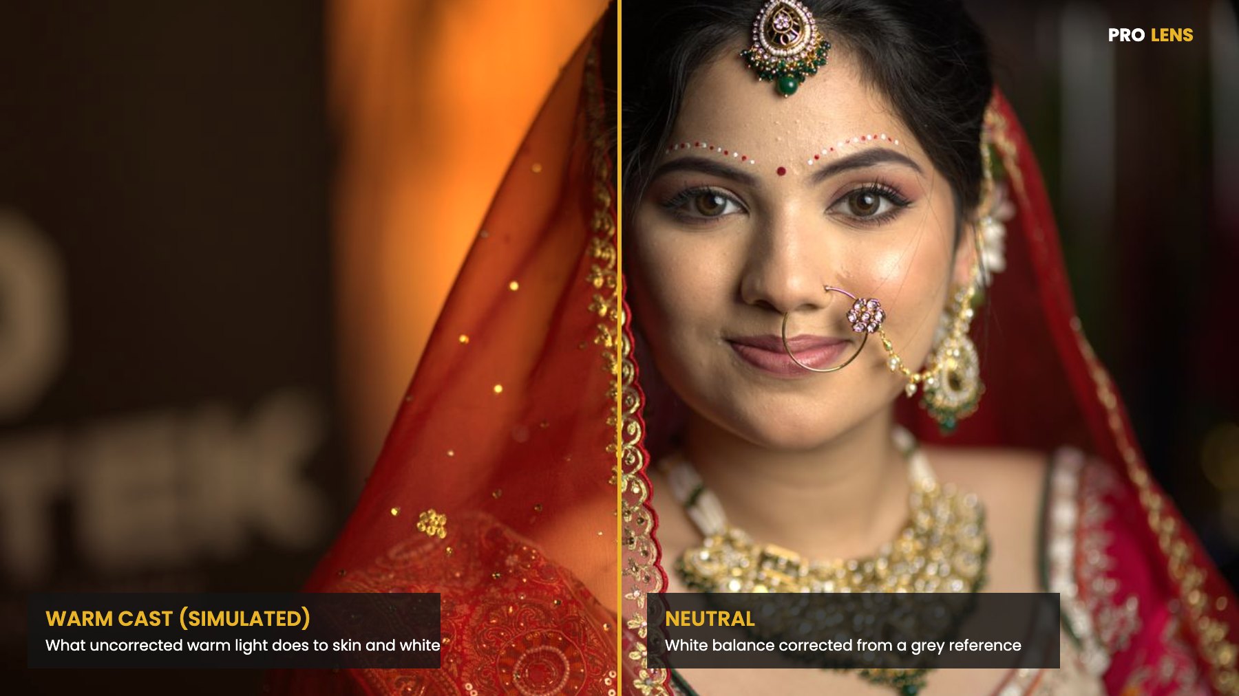
- Skin tones across a wide range, often within one family photo, need accurate mid-tones. A screen that runs warm hides a green or magenta cast that will show up in the album.
- Mixed lighting is the norm: warm mandap halogens, cool tube lights in the green room, LED walls on stage and harsh noon sun at a haldi.
Add in clients viewing on phones, families sharing photos on WhatsApp and albums printed at a lab, and you have three or four different outputs from one edit. Calibration is the common reference that keeps them consistent.
3. Start With White Balance at the Shoot
Calibration fixes your screen, but accurate colour starts in the camera. A single wedding day can move from candlelight to open shade.
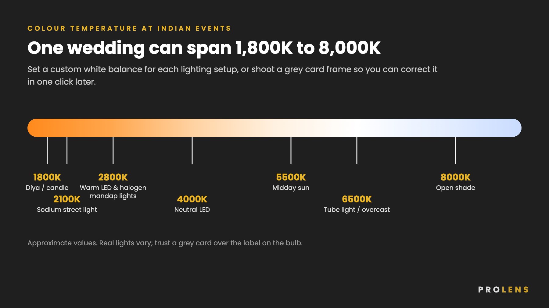
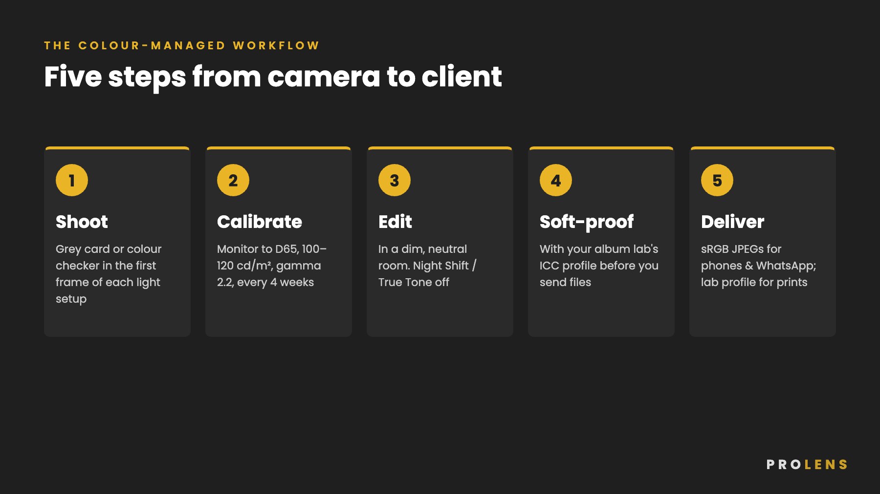
- Shoot a reference frame. Each time the lighting changes, take one frame of a grey card or a colour checker held in the subject’s light. In Lightroom, click the grey patch with the White Balance tool and sync that setting to the series.
- Set custom white balance for setups you will shoot for a long time, such as the mandap or the stage. Auto white balance struggles with strong warm light and heavy décor colours.
- Shoot RAW. It gives you full control over white balance later without losing quality.
- Watch for mixed light. If a window and a tungsten lamp both fall on a face, no single white balance will fix it. Move the subject or control the light.
4. Choosing a Monitor Worth Calibrating
Calibration makes a screen accurate within the range of colours it can physically show. It cannot add colours the panel cannot display.
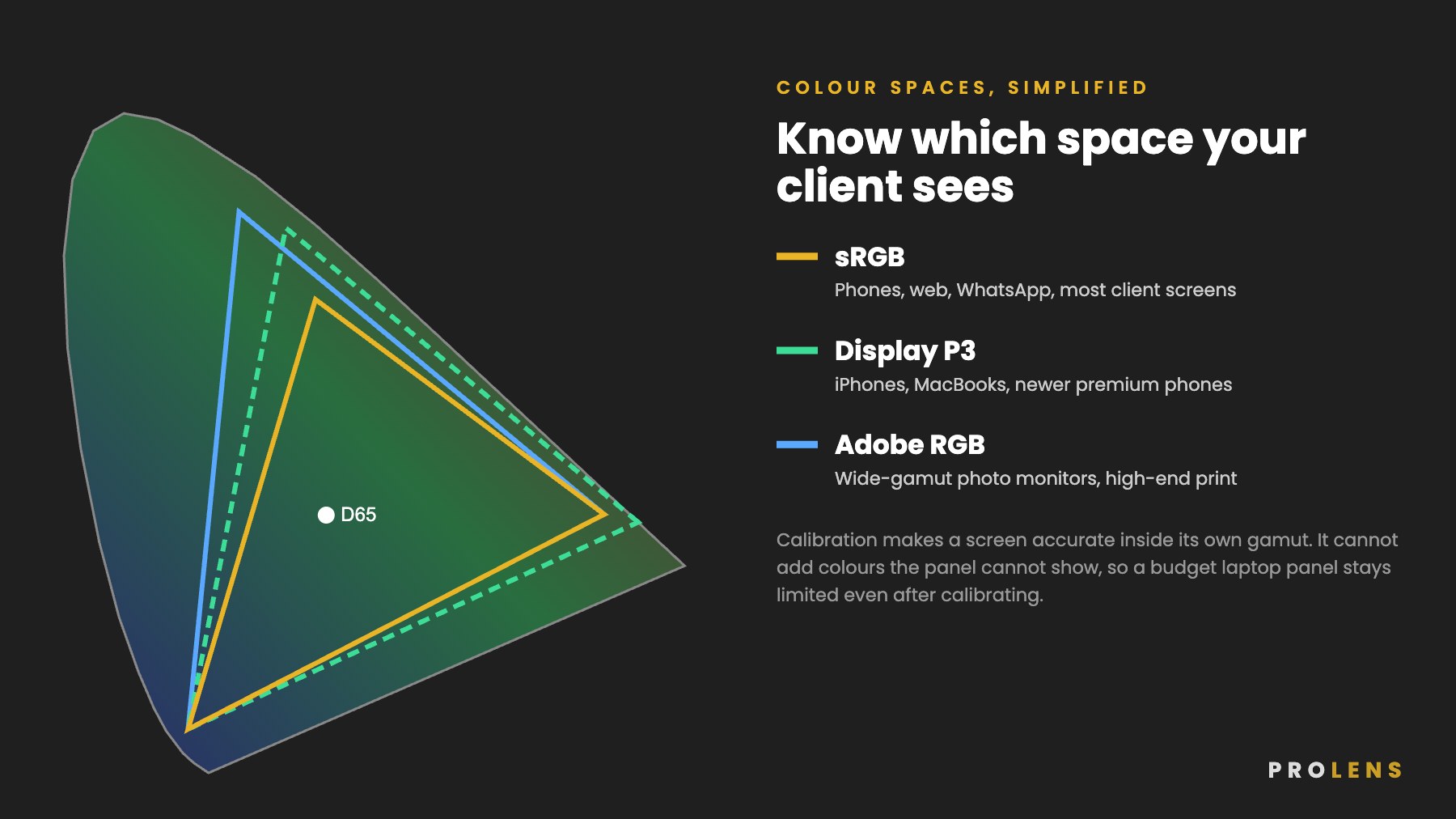
- For web, phone and social delivery: an IPS monitor that covers close to 100% of sRGB is enough.
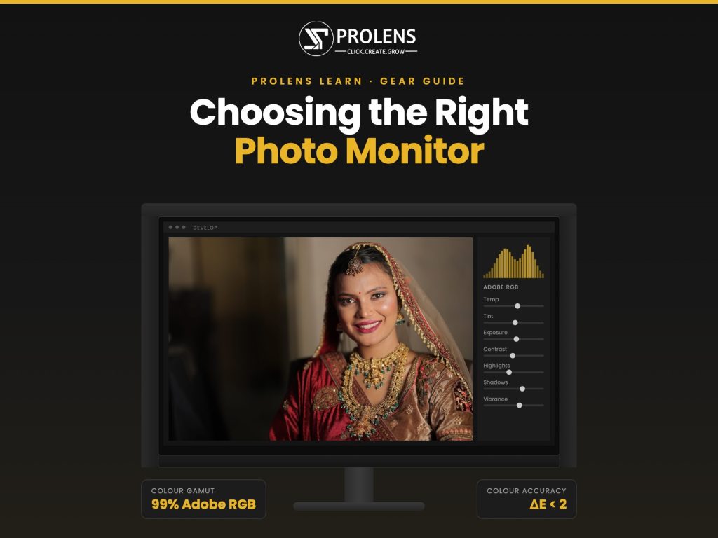
- For albums and fine prints: consider a wide-gamut photo monitor covering most of Adobe RGB.
- Budget laptops: many entry-level laptop screens cover only part of sRGB. Calibrating them helps, but they will still show weaker colour. If you edit on a laptop, connect an external monitor for colour-critical work.
- Glossy vs matte: matte screens handle reflections from tube lights and windows better in typical Indian studios and homes.
5. How to Calibrate Your Monitor
You will need a colorimeter. Popular options available through Indian camera dealers and online stores include the Calibrite Display range and the Datacolor Spyder range. Prices change often, so compare current listings from authorised dealers and check that the device is supported by your operating system.
- Warm up the screen for at least 30 minutes.
- Reset the monitor to its standard or sRGB mode and switch off dynamic contrast, eco modes and auto-brightness.
- Turn off Night Shift, True Tone or Night Light on your computer.
- Dim the room. Avoid a window or tube light directly behind or in front of the screen.
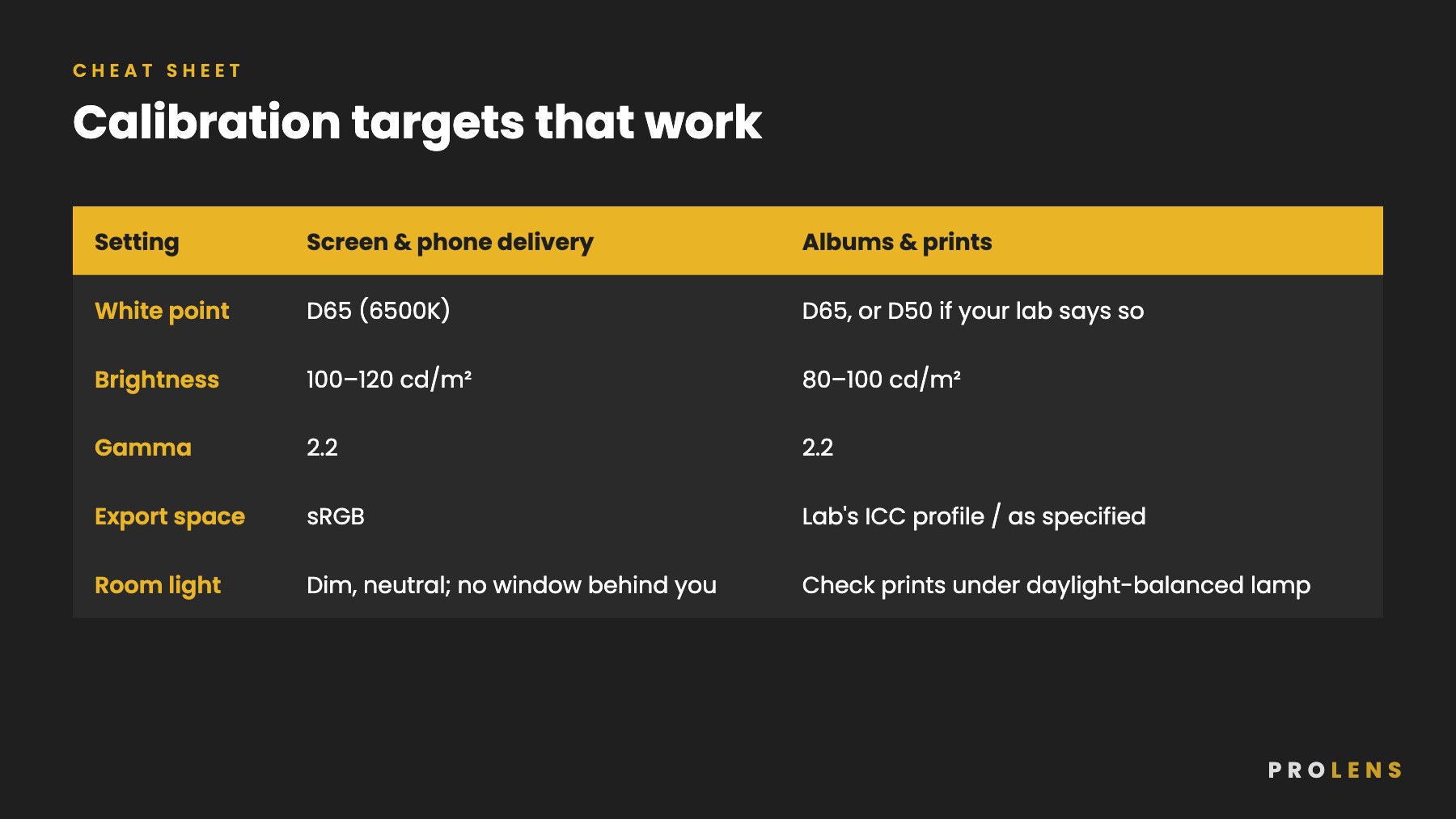
- Run the calibration software with the targets below, place the colorimeter on the screen and let it measure.
- Save the profile and let the software load it at start-up.
- Repeat every 4 weeks. Screens drift with age and heat.
6. Your Editing Space Matters Too
- Use soft, neutral lighting in the room. Bright warm LED bulbs or a cool tube light right above your desk will change how you judge colour.
- Keep walls behind your monitor neutral grey or white rather than brightly painted.
- Use a neutral grey or dark desktop wallpaper, not a colourful photo.
- Edit at the same time of day where possible, or close the curtains so daylight does not change through the session.
7. Getting Prints and Albums Right
Most complaints about album colour come from three things: a screen that is too bright, no soft-proofing and the wrong file colour space.
- Lower brightness for print work. A screen at full brightness makes every print look dark. 80 to 100 cd/m² is a good starting point for print matching.
- Ask your album lab for its ICC profile. Many Indian album and photo labs provide printer profiles for their papers. Install the profile and use Soft Proofing in Lightroom or Photoshop to preview the result before you send files.
- Send files in the colour space the lab asks for. Most labs expect sRGB. Some accept Adobe RGB. Sending Adobe RGB files to a lab that expects sRGB is a common cause of dull, flat prints.
- Order a test print when you start with a new lab or paper, and compare it with your screen under daylight-balanced light.
8. Delivering to Phones, WhatsApp and Social Media
Most of your clients will first see their photos on a phone.
- Export in sRGB for galleries, Instagram, Facebook and WhatsApp. Other colour spaces can look dull or oversaturated on these platforms.
- Check a few hero images on a phone before you deliver, especially skin tones and reds.
- Remember that phones vary. You cannot control every client’s screen, which is exactly why your own screen must be accurate. It is the one fixed point in the chain.
9. For Videographers
Wedding films carry the same risks. Calibrate your editing monitor to the standard your delivery uses, usually Rec. 709 for online and TV delivery, and check your grade on a phone before sending. If you shoot in log profiles, apply the correct conversion LUT before grading so your skin tones start from an accurate base.
Quick Calibration Checklist
- Grey card or colour checker frame for every new lighting setup
- RAW files and custom white balance for long setups
- Monitor calibrated to D65, 100–120 cd/m², gamma 2.2
- Recalibrate every 4 weeks
- Neutral, dim editing room
- Soft-proof with your lab’s ICC profile before printing
- Export sRGB for phones, galleries and social media
The Prolens Take
A colorimeter usually costs less than one wedding’s album printing, yet it protects every gallery, album and film you deliver. Calibrate once, check every month and you will spend less time fixing complaints and more time shooting.
Want hands-on help with colour, lighting and editing? Join a PROLENS PRO workshop in your city.


1 Comment
[…] For photography, a monitor that supports hardware calibration is worth paying for. BenQ’s SW series, for example, uses an internal 16-bit 3D LUT on models such as the SW242Q and SW321C, along with its Palette Master Ultimate software, which works with popular colorimeters from Calibrite and Datacolor. The calibration is saved in the monitor, so it stays correct even when you plug in a different laptop. For a step-by-step process, read our colour calibration guide for Indian photographers. […]